Truffi and Truffle

A calmer way to manage everyday pet care.

Truffle is a mobile pet care management concept that helps
owners understand what needs attention next, organize
everyday routines and keep essential health information in
one place.

ROLE
Product Designer - Solo project
SCOPE
Product thinking, research, information architecture, UX/UI, prototyping and brand design
Scroll to explore ↓
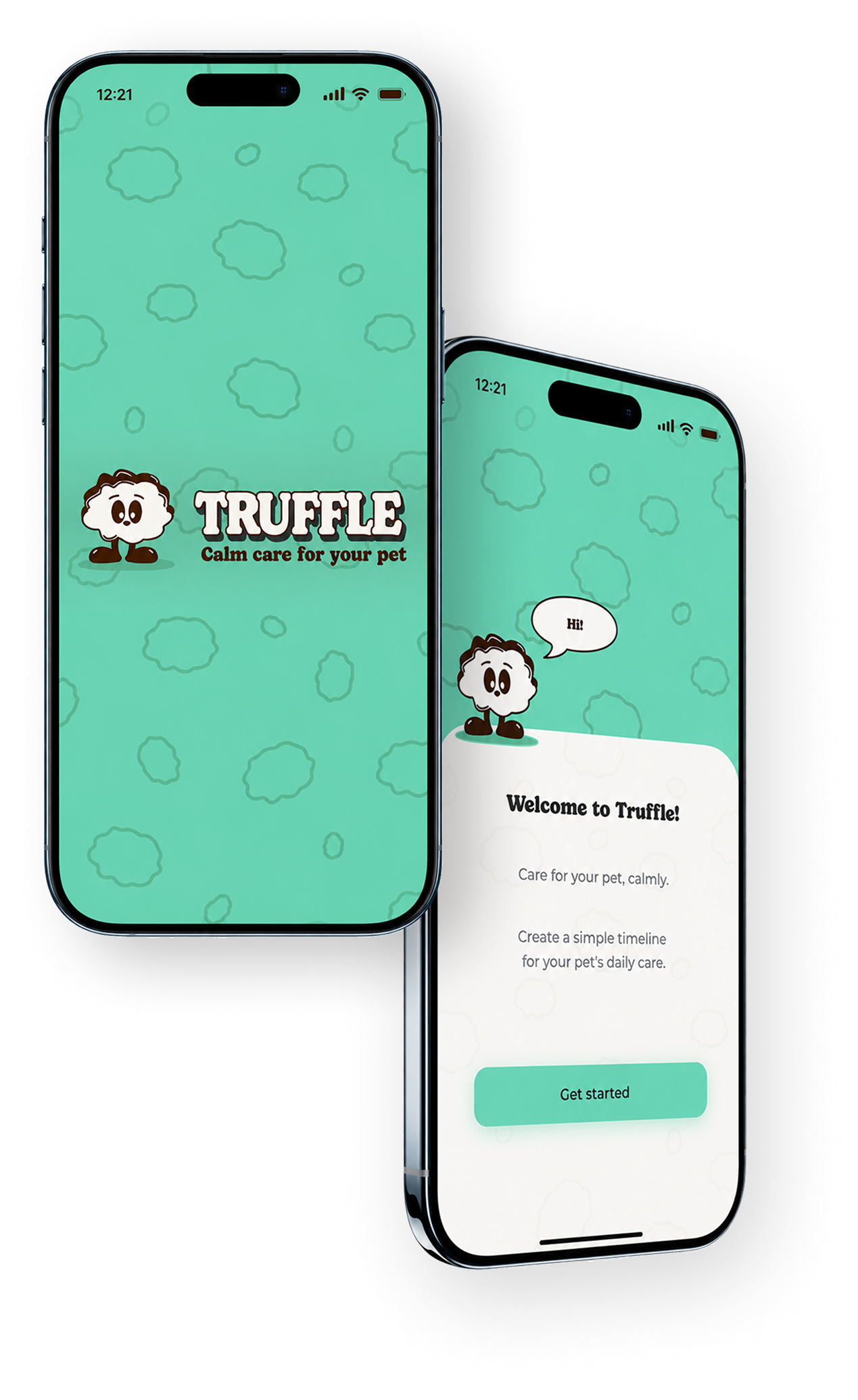
Two overlapping Truffle phone mockups

FROM A PERSONAL NEED TO A SHARED PROBLEM

Pet care involves a lot to remember.
Keeping track of it shouldn’t.

The starting point

As a pet owner and former veterinary nurse, I saw how easily care information could become fragmented across documents, notes, apps and memory.

I wanted one simple place to keep my cats’ essential information and understand what needed attention next, without turning everyday care into another complicated task.
What I discovered

To understand whether this was only a personal frustration, I spoke with two pet owners about how they managed routines, health information and upcoming care. Although these conversations were exploratory, three recurring problems emerged:
Documents and health information were stored in different places
Upcoming care was easy to forget until it became urgent.

Owners lacked a clear view of what had already happened and what needed attention next.
The challenge wasn’t adding more
information.

It was making the right information easier to remember,
access and share.

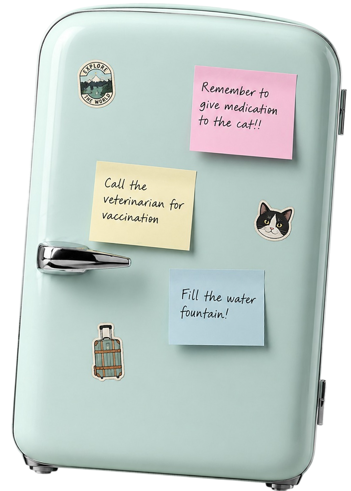
Refrigerator covered with pet care reminders

How might I help pet owners stay on top of everyday care
without making the experience feel overwhelming?

Product goal

  • Understand what needs attention next.
  • Record everyday care with minimal effort.
  • Access essential information when it is needed.

From scattered tasks to one clear care loop

I structured Truffle around a repeatable flow that reflects how everyday care happens:

  1. Choose pet
  2. Go to plan care
  3. See what is next
  4. Complete it
  5. Keep a record

Turning insights into decisions

The conversations with two pet owners helped me identify the main problems and refine how Truffle
should respond to them. These insights were translated into five key product decisions.

Building Truffle’s identity

It started from a concept

While looking for a name, I came across “trufa”, the Spanish word
commonly used for a dog’s nose because of its resemblance to a
truffle. Translated into English, Truffle became the name of the app.

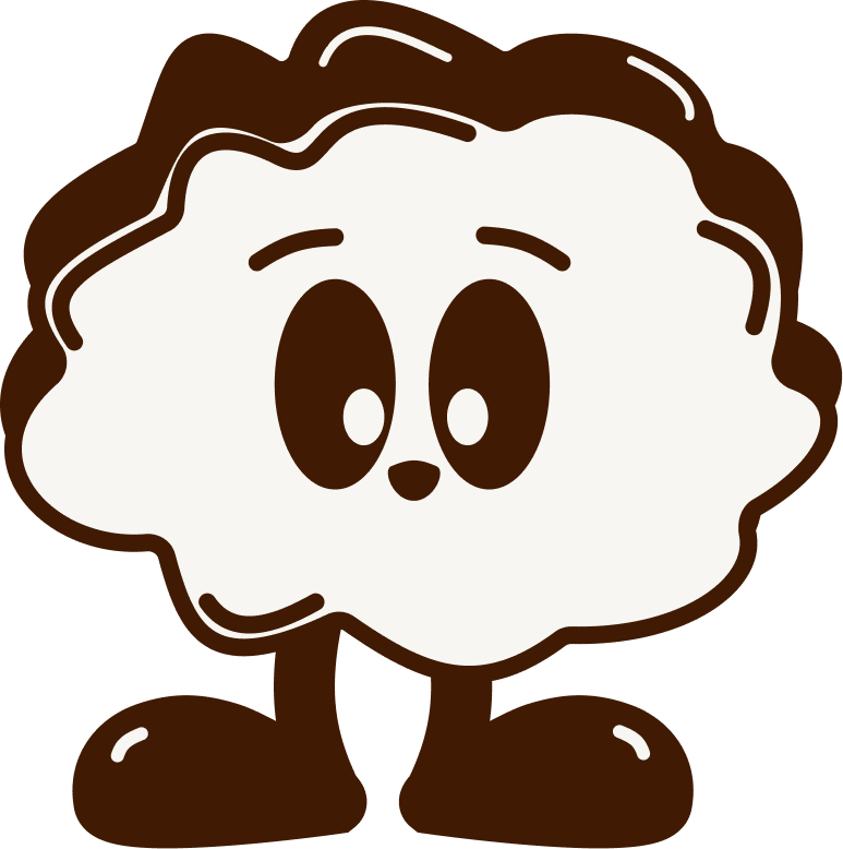
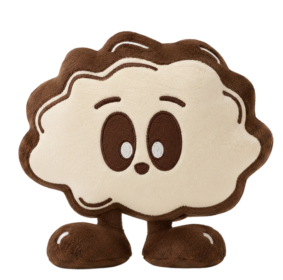
Truffi character

From Truffle to Truffi

The name inspired Truffi, a playful companion created to guide
pet owners through the app.

  • Emotional connection
  • Friendly guidance
  • Memorable identity

Visual foundations

The colour palette draws from:

  • Nature-related colors (Brown & White)
  • Weimaraner breed characteristics (Soft grey & Green)
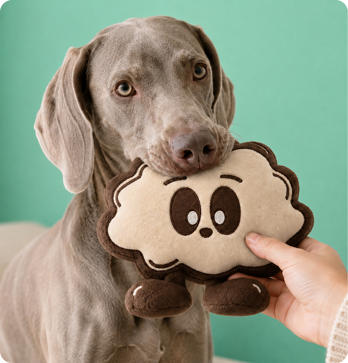
Weimaraner holding a Truffi plush

Deep Brown

#401A02

anchors the brand and reinforces recognition.

Warm White

#F7F6F2

creates a softer base than pure white.

Soft Charcoal

#2E2E2E

supports legibility in functional content.

Mint Green

#69D3B3

highlights actions, progress and positive states.

Typography choosen:

Montserrat - Aa Bb Cc

Keeps functional content clear and easy to scan.

Blacker Shield - Aa Bb Cc

Gives the brand an expressive and recognizable voice

Spacing:

A 4px-based spacing system
creates a consistent rhythm
across screens, components
and content hierarchy.

UI Principles

Calm first

Reduce visual noise and avoid
unnecessary urgency.

Clear hierarchy

Make the next action and essential
information easy to identify.

Friendly & functional

Add warmth without compromising
usability.

Reusable patterns

Keep interactions familiar and
consistent throughout the product.

Creating consistency across the experience

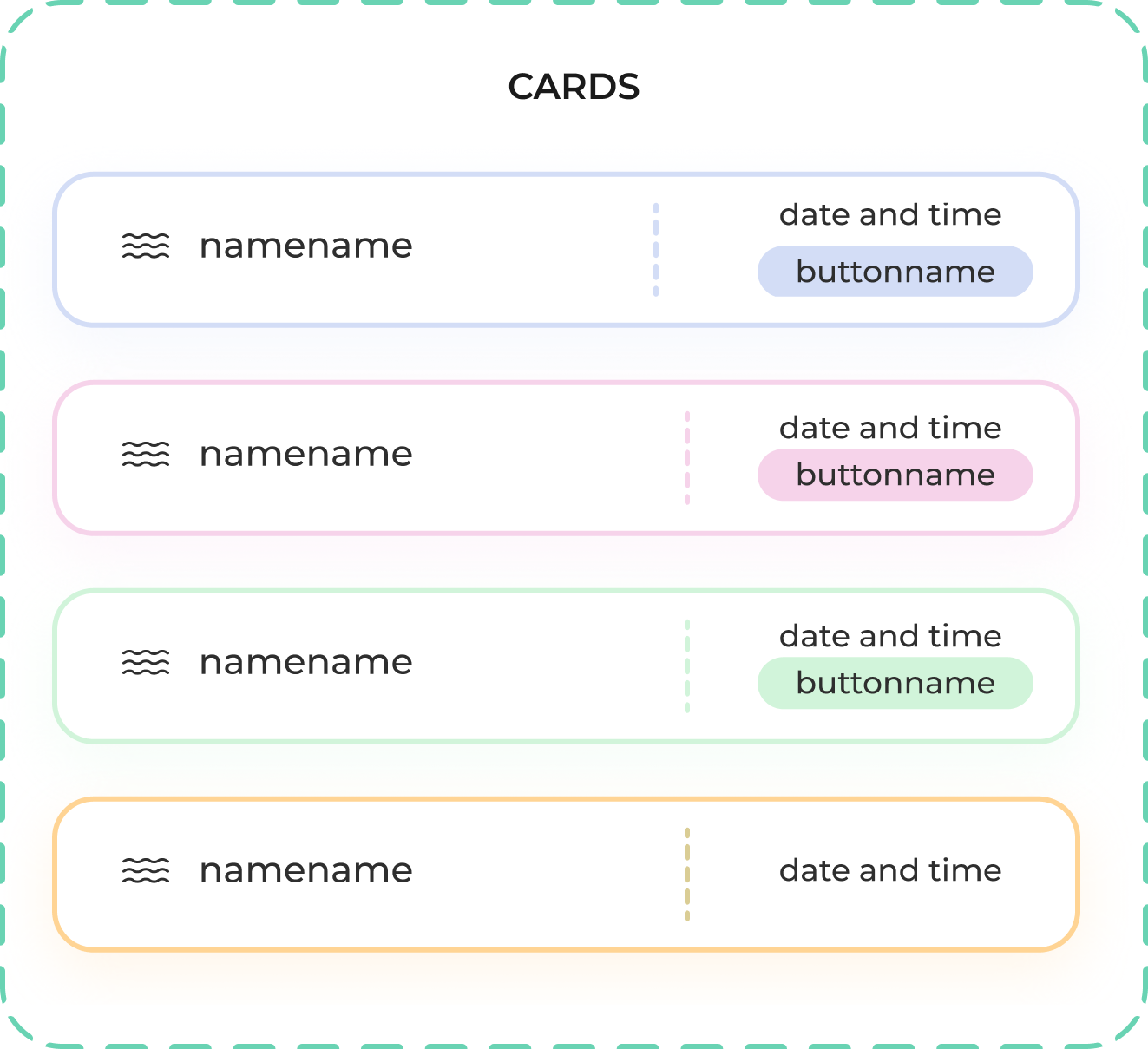
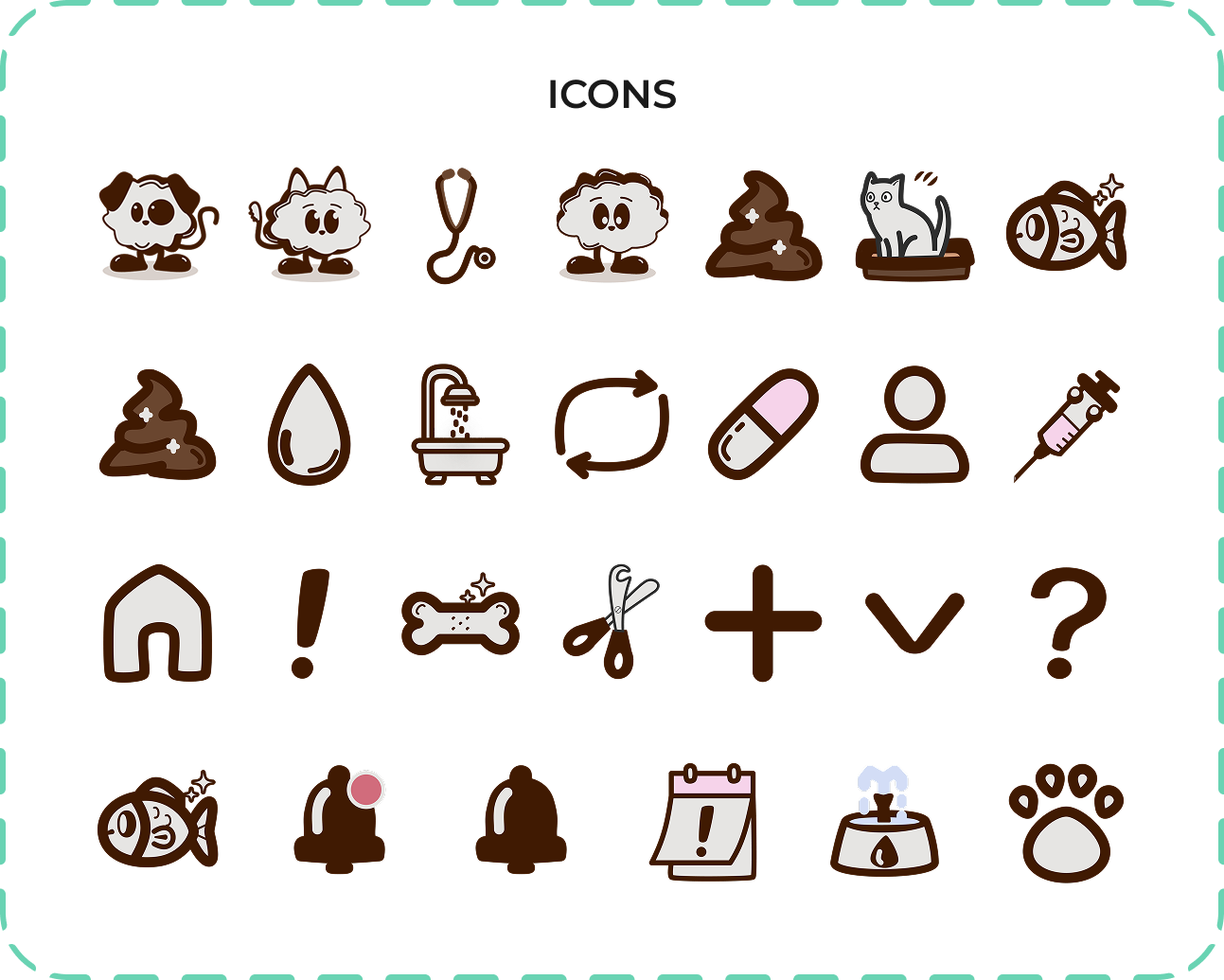
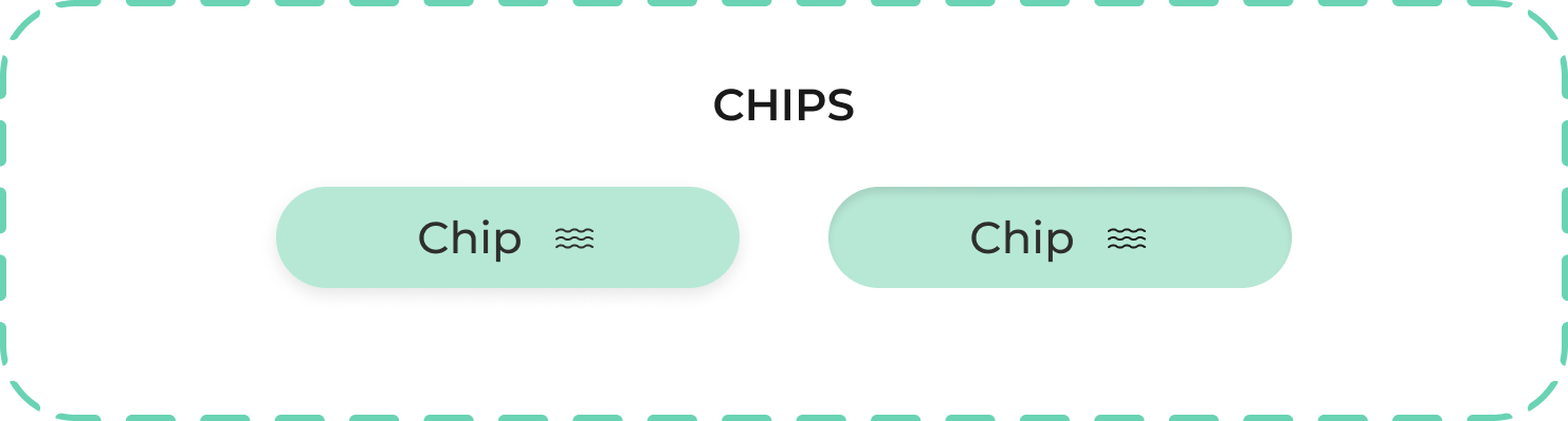
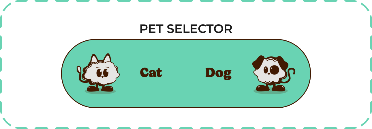
To translate the visual direction into the interface, I created reusable patterns for navigation, cards, selectors,
buttons, chips, inputs and icons.

The same structures can support different types of care information while maintaining consistent spacing,
hierarchy and interaction behaviour.

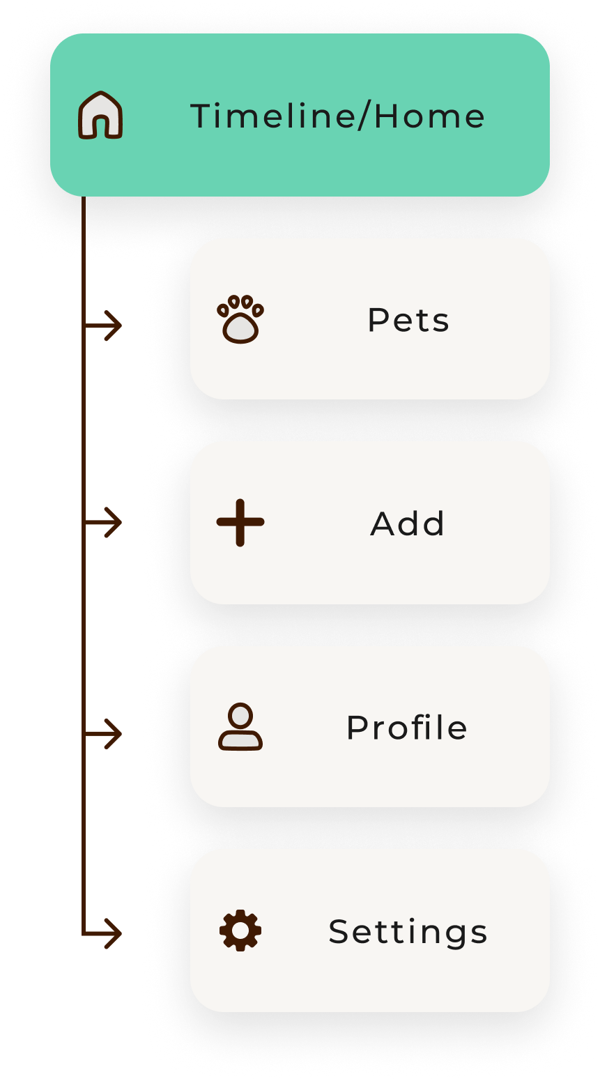
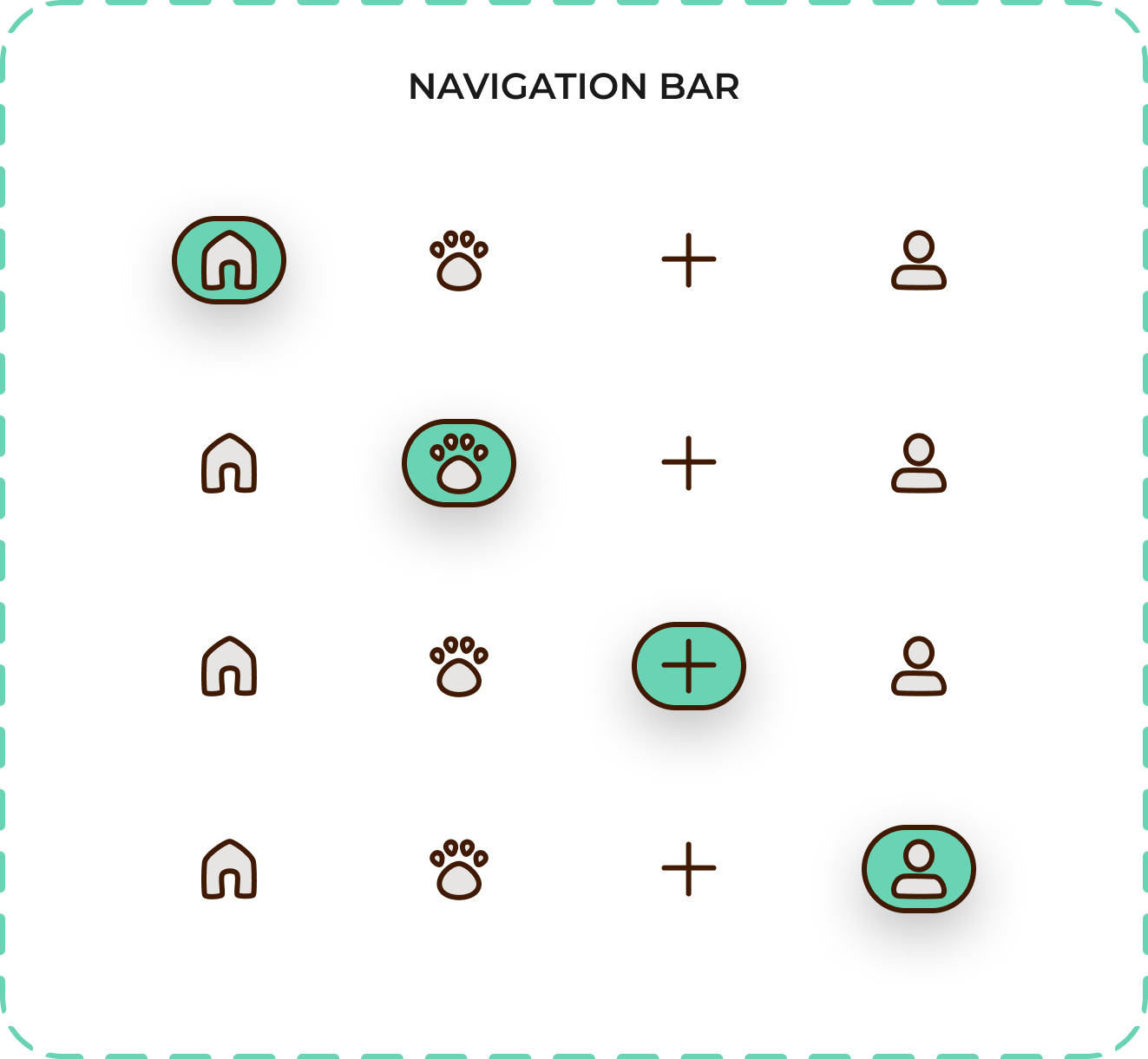
Truffle navigation bar component states
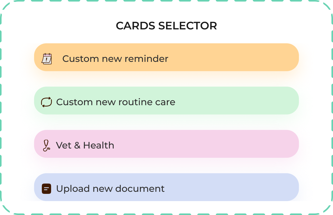
Truffle card selector components
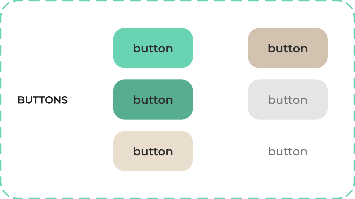
Truffle button components
Truffle information card components
Truffle personalized icon system
Truffle chip components
Truffle pet selector component
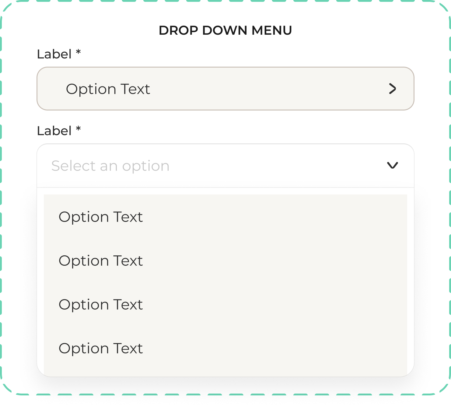
Truffle dropdown menu component

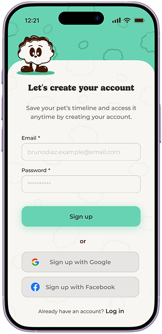
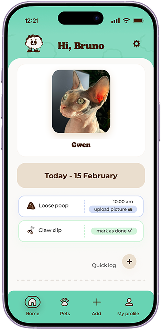
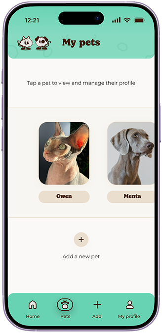
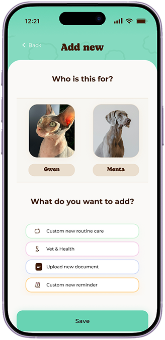
The final experience - hi-fi prototype

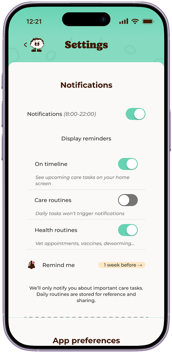
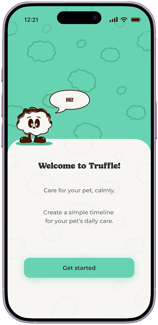
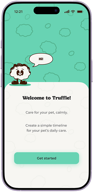
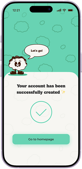
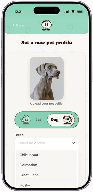
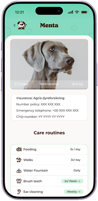
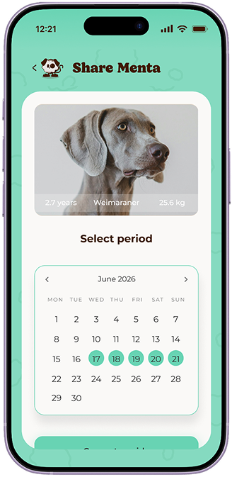
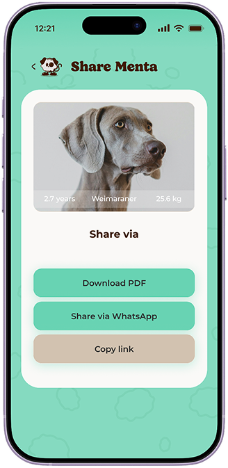
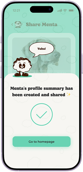
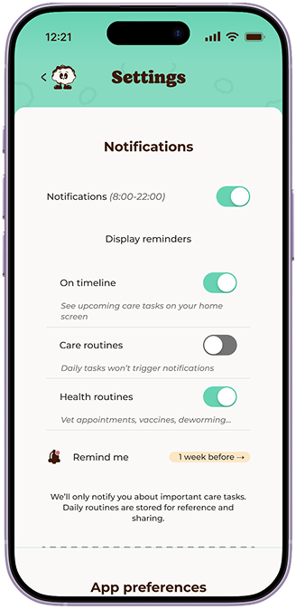
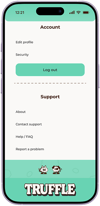
Truffle app screen 1 Truffle app screen 2 Truffle app screen 3 Truffle app screen 4 Truffle app screen 5 Truffle app screen 6 Truffle app screen 7 Truffle app screen 8 Truffle app screen 9 Truffle app screen 10 Truffle app screen 11 Truffle app screen 12 Truffle app screen 13 Truffle app screen 14

Exploring a dark mode

Click on the screen and see the magic ✨

Trying to make the experience more comfortable for daily
use, especially in low-light situations.

The identity beyond the interface

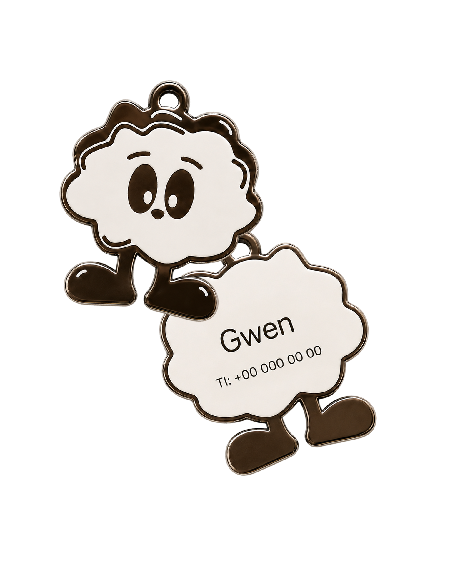
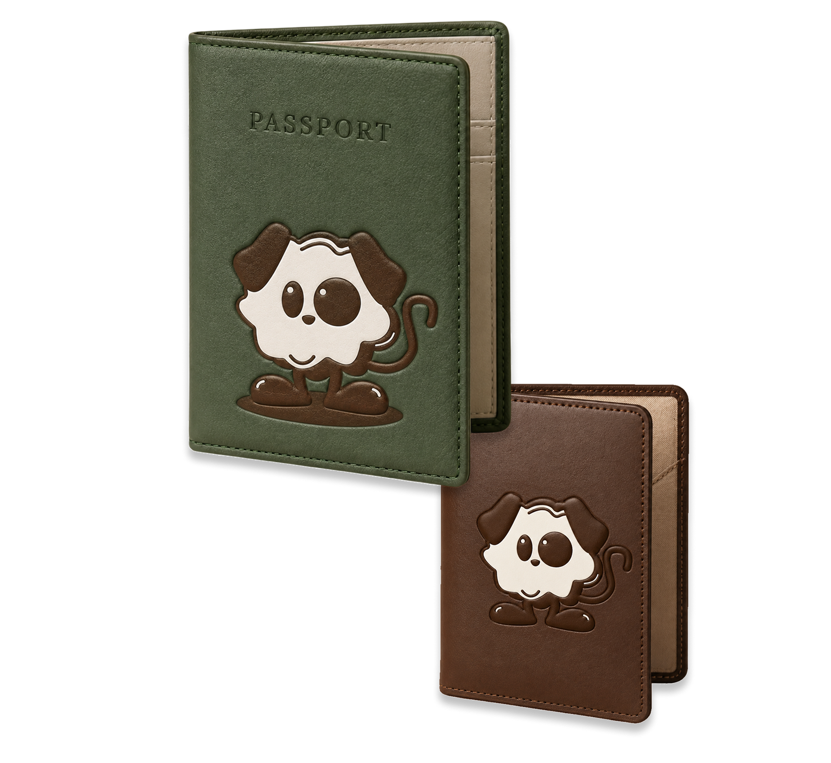
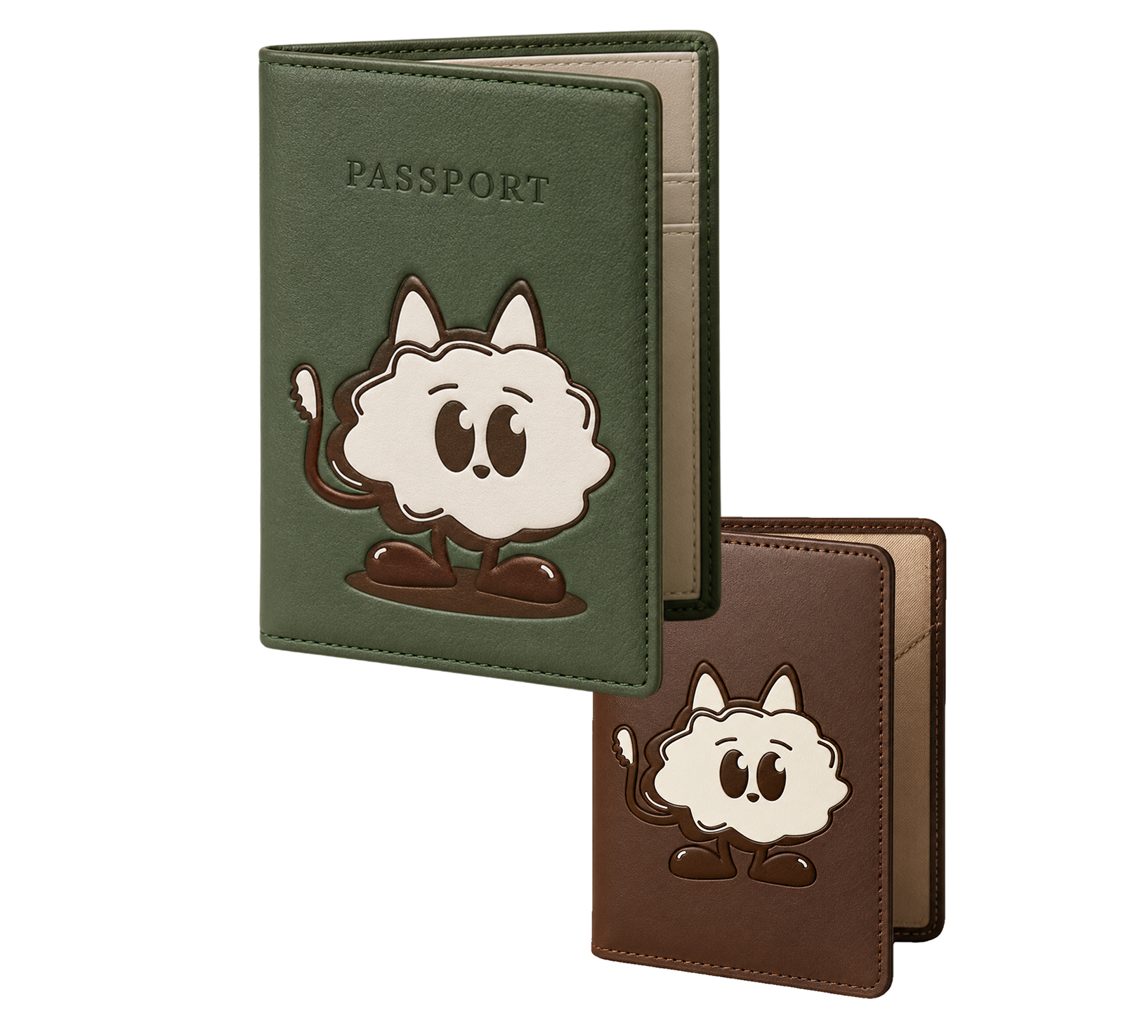
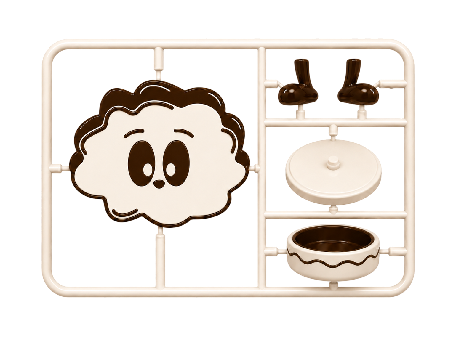
To explore whether Truffle remained recognizable outside the digital product, I applied the identity to a small
set of speculative physical touchpoints.

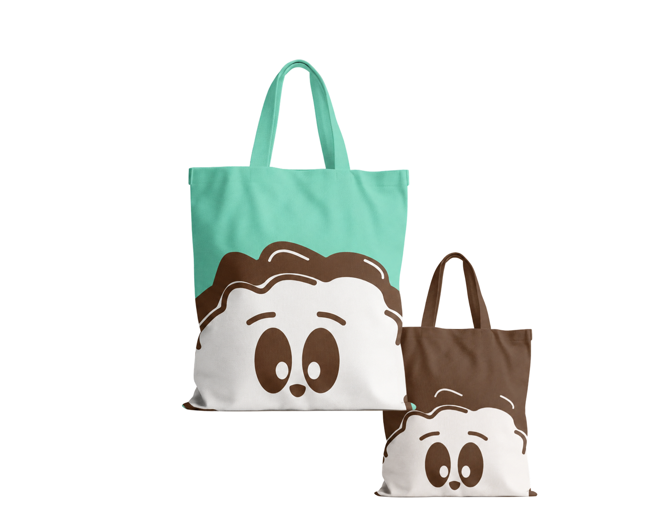
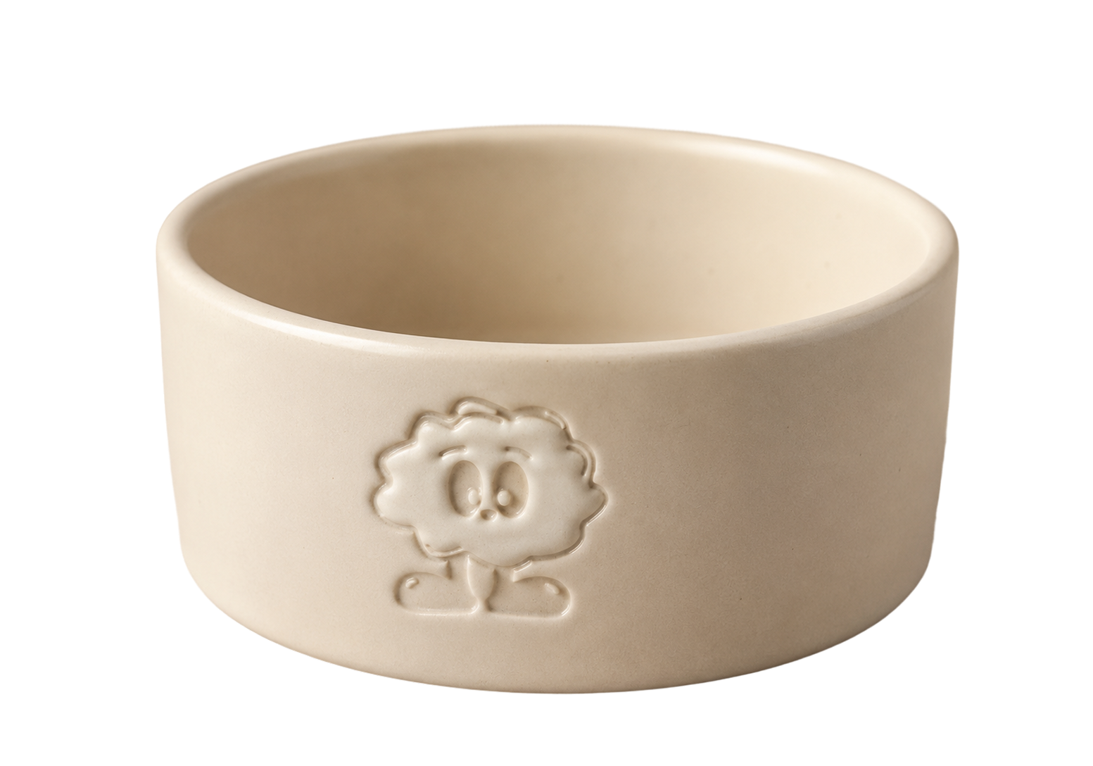
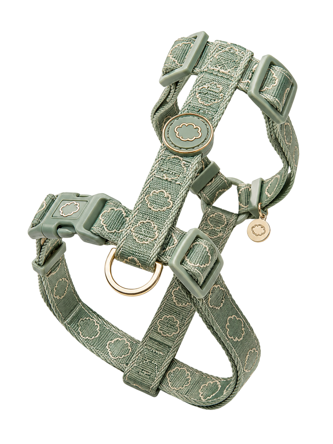
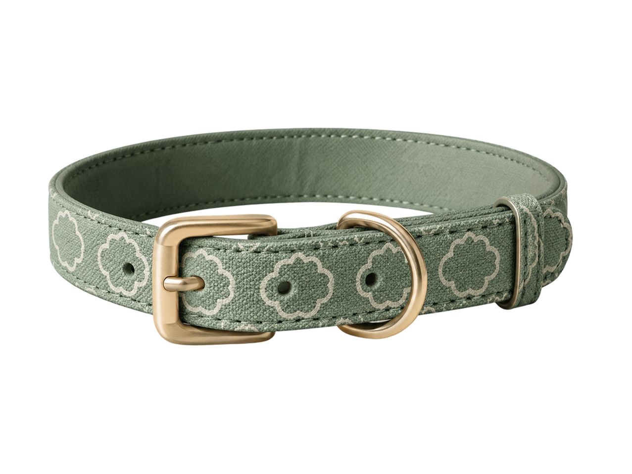
These explorations are not part of the product’s first version. They show how the character and visual system
could extend into a broader pet-care brand.

One system.
From product thinking to visual identity

Where Truffle is now

Truffle became a complete high-fidelity prototype,
from the main user flows to the visual identity and
reusable components.

It has not been developed or launched, so I cannot
measure its real impact yet. For now, the result is a
clear product direction that I could continue testing
and improving.

What I would test next

Truffle is still a concept, and the feedback came
from a small group.

My next step would be to test the main flows with
more pet owners, especially people who share pet
care or manage ongoing health conditions.

Ideas for the future

Passport icon

Pet passport

Expenses icon

Expenses

Map icon

Map tool

Veterinarian icon

Vet integrations

What I learned

I learned that making a product feel simple is not the same as making it basic.
I had many ideas for Truffle, but adding all of them would have made the experience more confusing.

Designing the product and the brand together also showed me that personality works best when it has a purpose. Truffi should guide or reassure the user, not appear everywhere just because it looks cute.

The hardest part was deciding what not to add, and that is probably the most valuable thing I learned from this project.

Truffle started with a simple idea.
What could we build together?

I’d love to hear your thoughts, talk about the process or
explore how I could contribute to your team.

Get in touch
Truffi character